
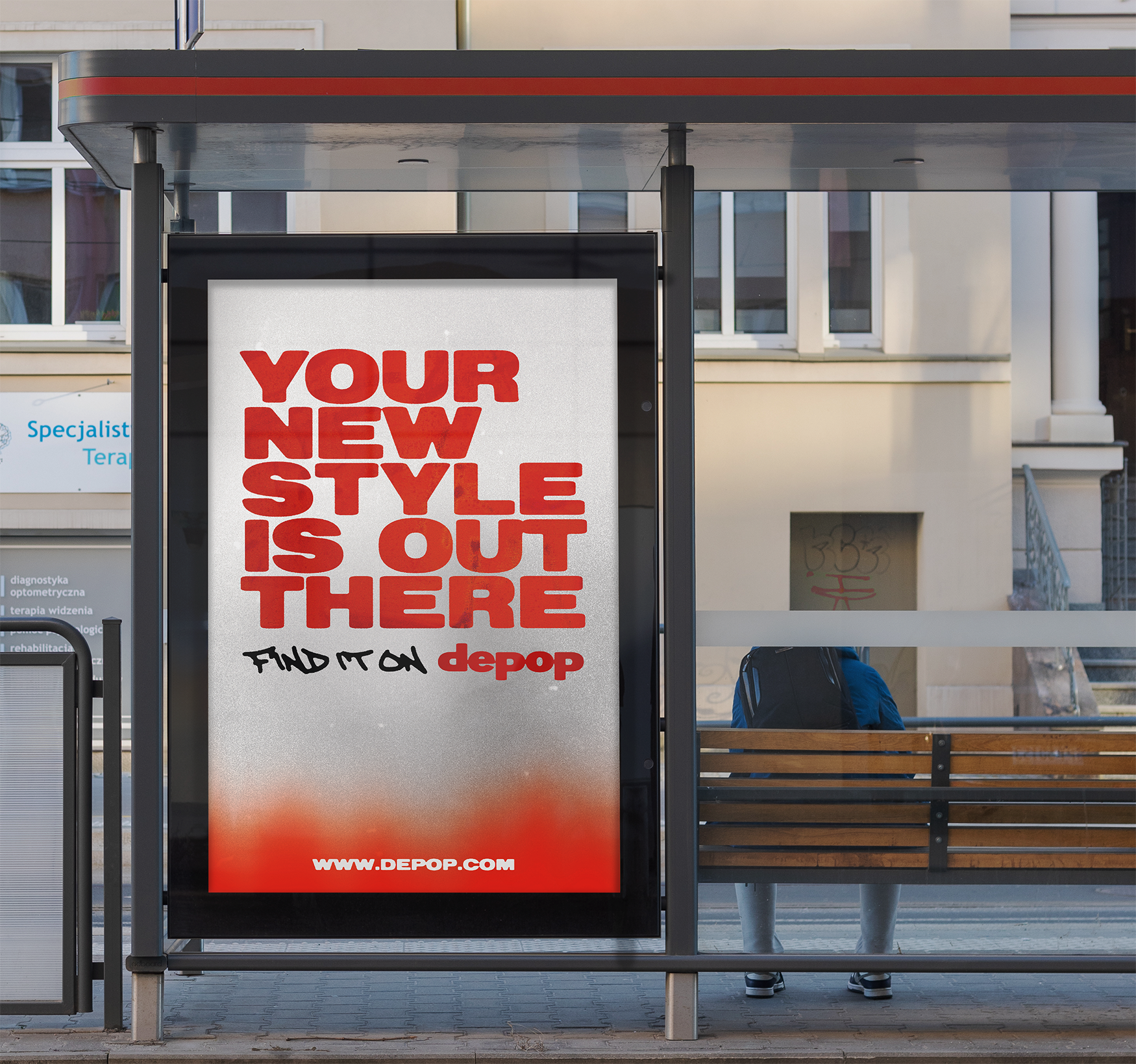
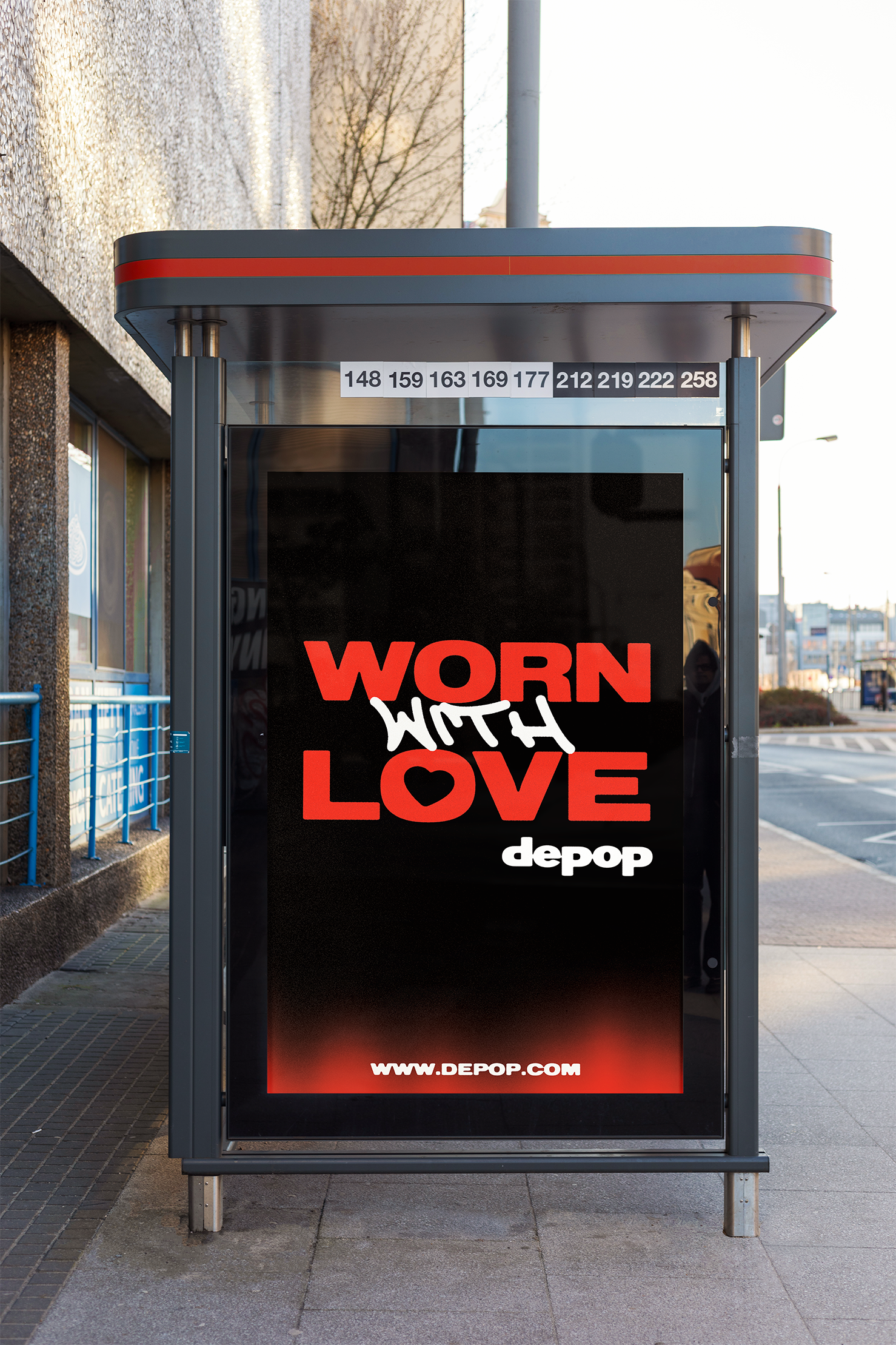

An eye-catching advertising campaign intended to run in subways and bus stop locations using primarily type. Because a vast majority of Depop's branding relies so heavily on imagery, I decided to use grungy textures and bold, ink-stained type to replicate the feeling of the photos in their advertisements.