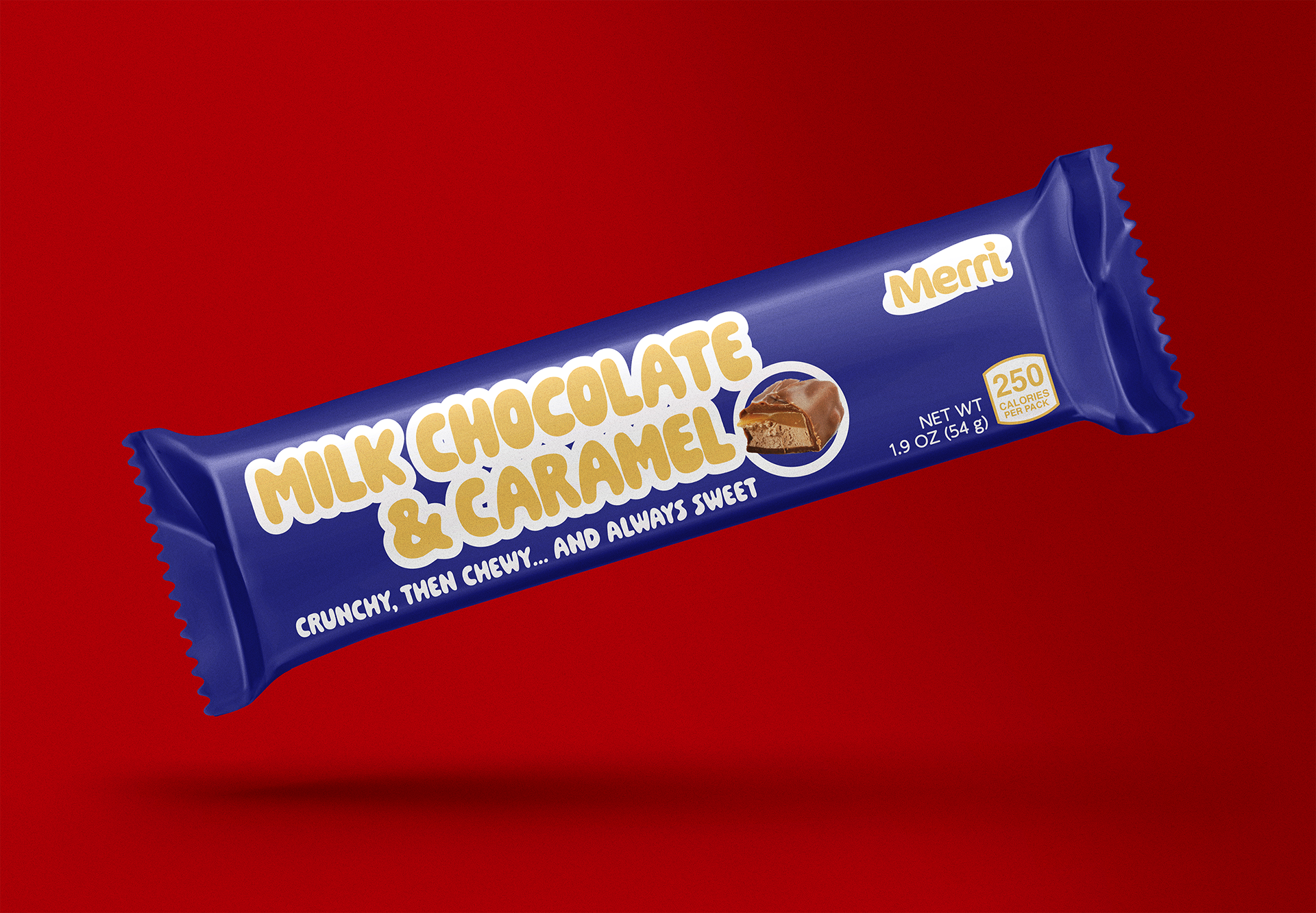
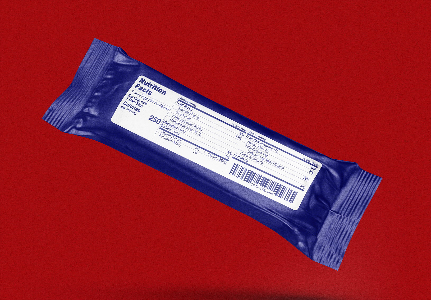

Chocolate bar packaging design concepts for fictional candy company, "Merri". The vibrant color choice and simplistic, lively type are utilized to catch the eyes of younger audiences at store checkouts.
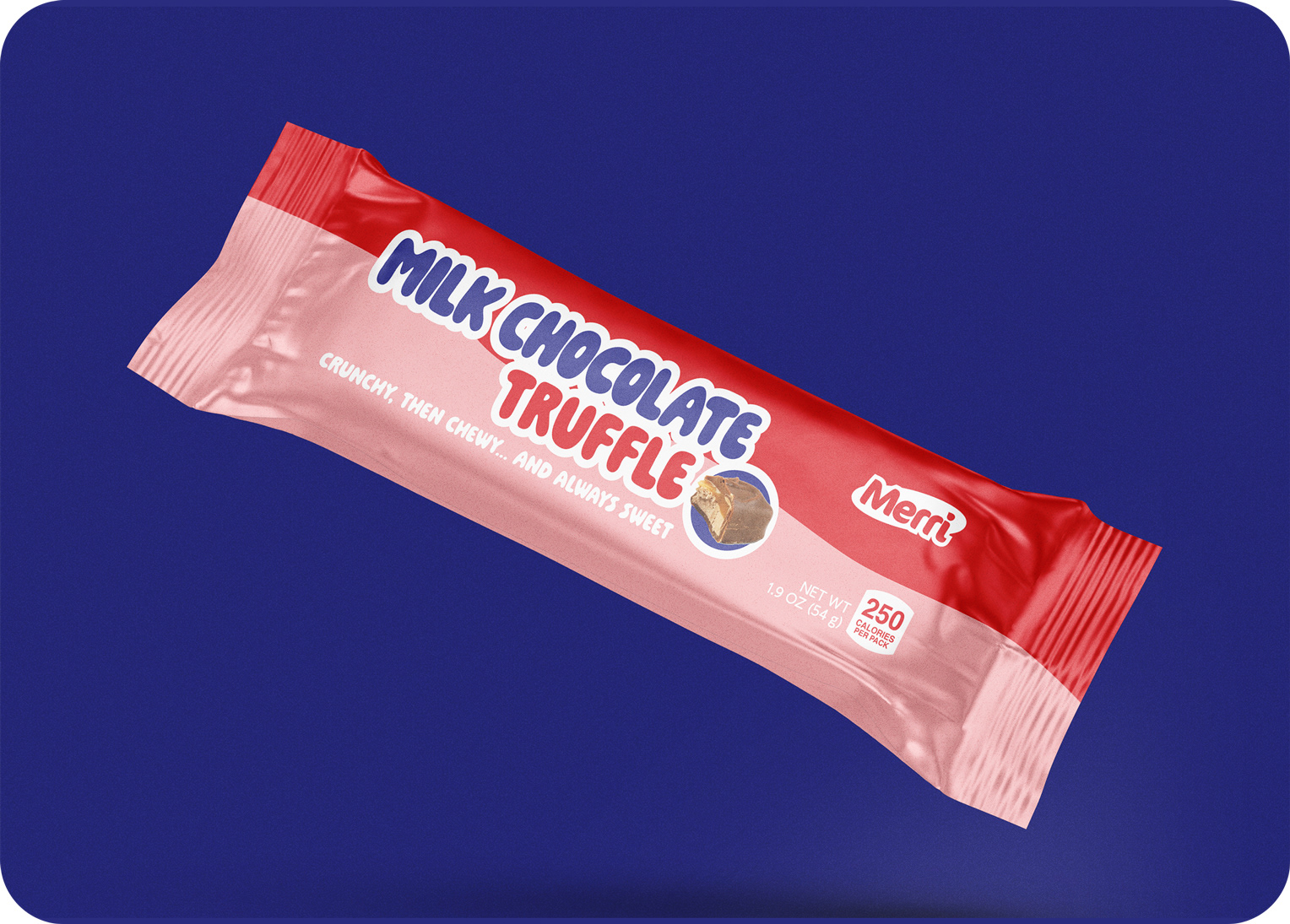
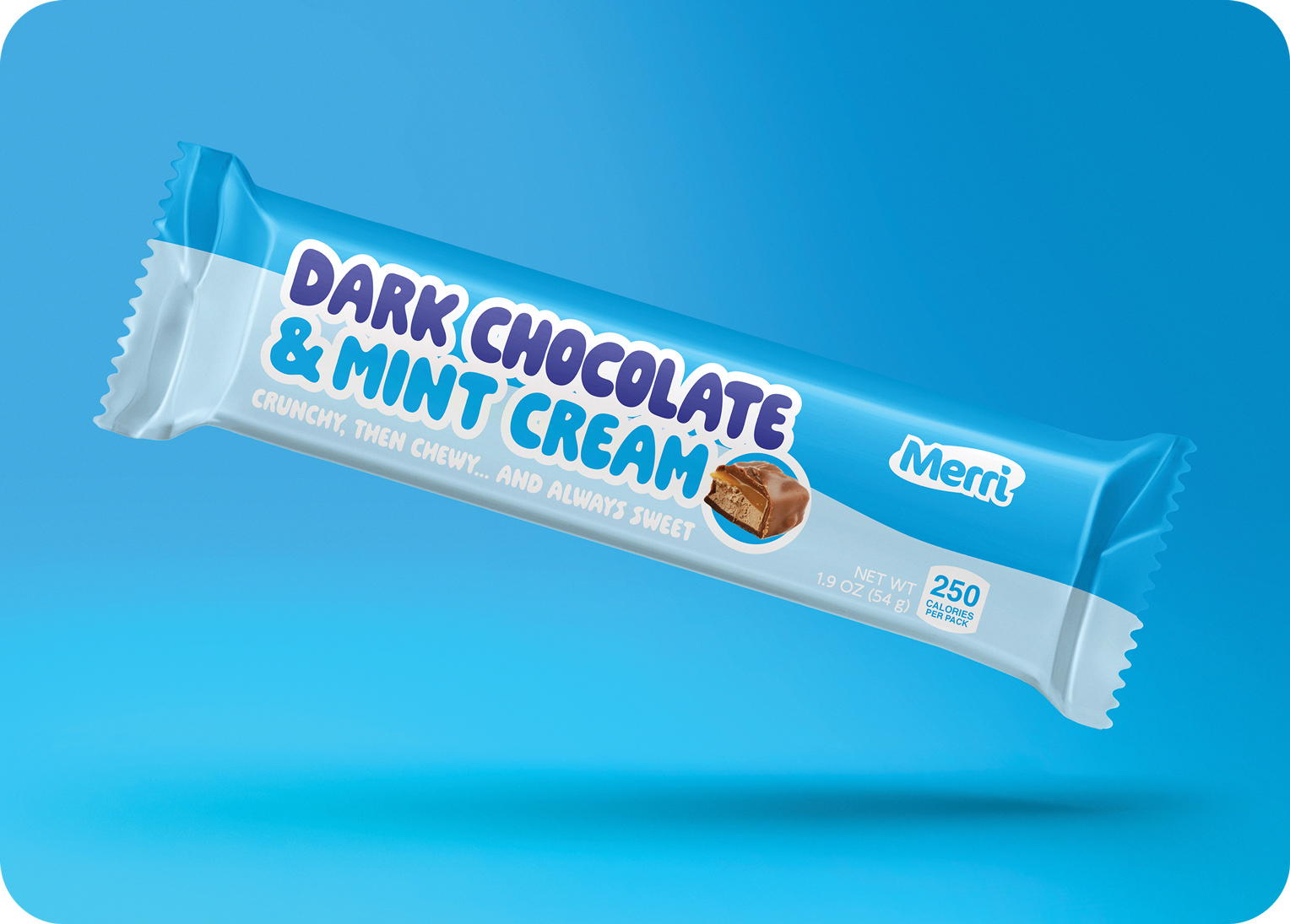

Because Merri is a candy company with a younger target audience, the logo was designed with a rounded sans serif typeface presenting youth and joy—something that children will resonate with.